When companies are creating a new brand identity, an modern and updated logo design is usually a top priority. Our team of talented designers took a deeper look at some companies that have gone through recent rebrands and changed their logos with creative new looks. Together, we’ve analyzed what encouraged these companies to switch up their looks, and the deeper meanings behind each of the designs they chose for their finished products.
Major League Soccer
2015 marked the 20th season for Major League Soccer. Therefore, a rebrand was needed to not only mark the anniversary, but to honor the exciting developments such as new clubs, media partnerships, stadiums, and players that will be joining the league in the coming years.
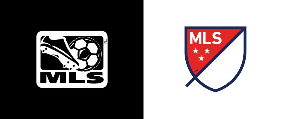
The original logo for the soccer league was very literal, including a foot hitting a soccer ball to avoid any possible confusion. It was also very colorful, making it very noticeable no matter what jersey or media material it was being used on.
The new logo was rebranded for simplicity, and a lot of thought was put into each and every aspect of the updated design. Rather than showing audiences the game, the new logo is designed to represent the “feeling of the game.” Each line, color, and letter is included to represent something specific in relation to the league itself. From the slash dividing the design into two halves representing the speed and energy of the game, to the perimeter of the design illustrating the field of play, and even the three stars that acknowledge the three pillars of the MLS brand; For Club, For Country, and For Community.
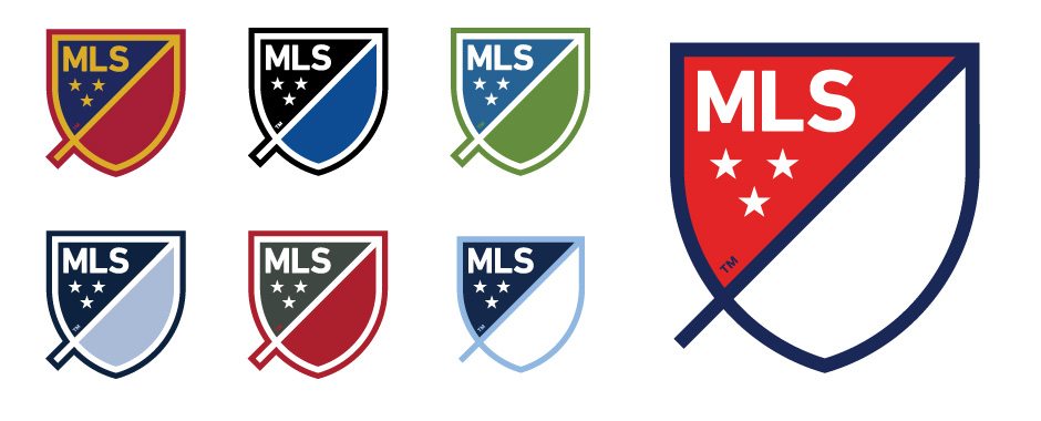
The design clearly had a lot of thought and consideration put into it as the league continues to drive their brand forward. Most notably, they created a black and white version of the logo so that it can be re-adapted and customized to match the coloring of each individual team within the league itself. Therefore each team can rebrand the logo to match THEIR specific branding. This design was done with a 360 degree approach, with careful consideration of who and what the new logo would impact along the way.
One of the more famous logo redesigns of the past year was met with a lot of public criticism. For one of the most innovative companies in the world, it was time for Google’s logo to reflect their business and where they are trying to take their brand in the future.
The original logo had evolved a lot over the years, but it was clearly still very dated, and didn’t accurately project how far the company had come over that period of time, nor did it reflect their ambitions.
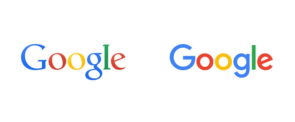
We immediately notice the new typography, and the familiar, yet updated, 4 colors that everyone associates with Google. The new design is simplified and modern, yet still colorful, friendly, and approachable. Google redesigned the icons for all of their collateral to match the updated logo, using the colors strategically throughout all of the brands and products. While this redesign may have thrown audiences off for a little bit, it lays the foundation for a company that is making large strides into the future, and creating a new brand identity to match those efforts.
DC Comics
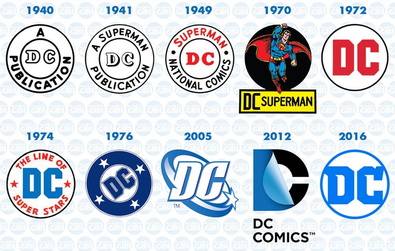
In an ode to the history of the company, DC Comics created a new logo that has a simple, easy, and clean design that incorporates aspects from the earliest years of the brand.
Their most recent logo design had a “peel effect” that eluded the turning of a comic book page. While the new design is a big difference from the previous one, fans will notice the similarities the redesign has to even older versions of the DC iconography. The new look takes different pieces of older versions of the DC logo, and update it for a modern and clean look.
U.S. Soccer Federation
Major League Soccer wasn’t the only soccer organization that experienced a recent rebrand. There have been a number of updates and chances for USA Soccer in the past few years, and with that, they required an updated look. For starters, its common knowledge that a “star” above a soccer logo indicates that the team has won a World Cup Championship. The original USA Soccer logo had three stars incorporated into their design. Naturally, this was in homage to our country’s flag, but confusing and misleading considering the men’s team had not yet won a World Cup. While the women’s team logo will have three stars prominently placed above their logo to represent their World Cup victories in 1991, 1999, and 2015, the standard logo will look like the one below:
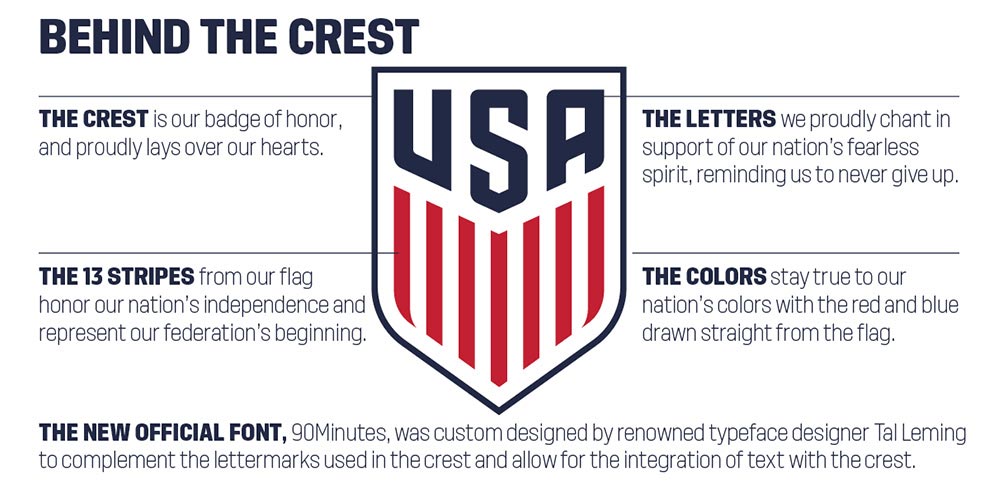
The new design is clean and streamlined, keeping the shield from the original logo, but getting rid of the redundant and unnecessary soccer ball that was included. The logo also includes a new custom font, 90Minutes, and has been color corrected, making it easy to add the logo to different collateral, merchandise, and marketing materials regardless of color.
Without losing any patriotism, the new logo still pays homage to our nation’s flag with 13 red and white stripes prominently placed within the crest, right below the “USA” that will proudly fall over the hearts of each player’s jersey.
Domino’s
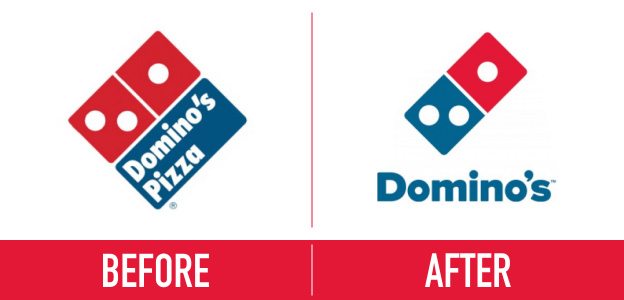
As Dominos went through a massive corporate rebrand, the design of their logo needed to reflect the fact that their product and service offerings have evolved far beyond just pizza. The organization hadn’t changed their logo in 15 years, and this redesign was going to affect the stores, marketing collateral, menus, vehicles, and more. It wasn’t just their logo that was changing, it was their entire company.
Domino’s created an audience-involved campaign surrounding their entire rebrand in order to get fans invested in the transition. They launched the “Ultimate Delivery Vehicle” contest where audience members and customers could suggest what features and elements would be included in the perfect food delivery vehicle. Outrageous suggestions aside, this was a great way to get everyone involved in the company rebrand, and familiar with their new logo design.
In the end, they dropped the “pizza,” simplified the design, and updated the font, but the complete Domino’s rebrand went far beyond that, and we are still recognizing those changes in their stores and services today.
Spike TV
As Spike makes the transition from a television channel targeted strictly towards young men, to one that provides content that appeals to both men and women, they needed a new brand identity that was more universal, less harsh, and less masculine.
This logo redesign was created in conjunction with an entirely new brand strategy in which the television channel launched a bunch of new programming, and a new slogan; “Spike: The Ones to Watch.”
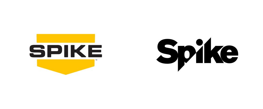
They got rid of the shield look, but maintained the edge that their old logo had by creating a visually sharp look, or a “spike” that travels directly through the center of the design. This element creates something that I like to call a “visual onomatopoeia.”
The network wants to create a new atmosphere that alludes “approachable edginess,” and their new logo certainly achieves that. Their programming is now much more inclusive than in previous years, and Spike continues to be a more general entertainment provider rather than a strictly for-male content creator. Their original content still has a certain level of appeal that comes from a very specific point of view, but that serves the interests of both both men and women now. I think it’s safe to say that now their logo now fits that mold as well.
HP
The push for a new HP logo has been a long and slow one. The design started back in 2008, but was just featured on the first product in 2016. Immediately we can see that the new design gives the brand a more high-end look that previous logos, and its clean look allows them to now stand out amongst other tech competitors who thrive on modernity and simplicity (I’m looking at you Apple).
This minimalistic design is a bit of a deviation from their recognizable blue logo from the past. However, the brain of the customer fills in the gaps presented by the design, and they are still able to figure out the brand that is associated with the new logo.
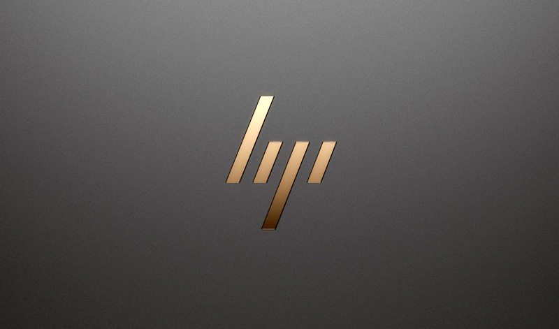
With a number of other internal changes going on throughout the company between the start of the redesign and now, the logo may have fallen to the bottom of the priority list. However, even if the company is still experiencing hesitations when it comes to moving forward with a full push of the bold and refreshing logo, it’s clear to see that even long-standing brands can benefit from a more modern approach.


